
Open Source · React · Figma · Storybook
Enterprise-ReadyRaaghu Design System
An AI-powered React library that bridges Figma and code — so teams ship consistent, accessible, production-ready interfaces up to 3× faster.
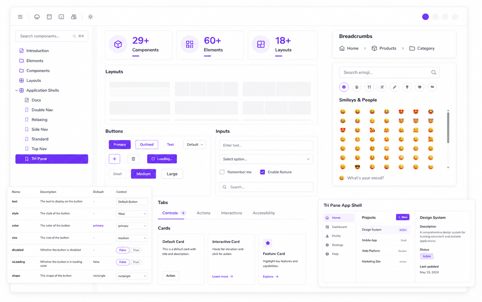
What is Raaghu Design System?
Raaghu Design System is an open-source React UI library from Wai Technologies. It gives designers and developers a shared language — a Figma design kit on one side, production-ready React components on the other.
- Build web applications with a consistent, themeable UI
- Extend to Microsoft Power Apps with compatible component patterns
- Accelerate delivery with AI Pundit design-to-code and Figma Code Connect
- Document and test every component in Storybook
Published on npm as @waiin/raaghu-react under Apache 2.0. Built with React 19, TypeScript, Vite, MUI 7, and Storybook 10.
Why choose Raaghu Design System?
Built for speed, alignment, and enterprise scale.
Fast
Up to 3× faster front-end development through modular components, app shells, and reusable layouts.
Consistent
Shared design tokens, light/dark themes, and standardized patterns keep every screen visually aligned.
Design-aligned
Figma Code Connect keeps designers and developers on one source of truth.
Open & documented
Apache 2.0 on GitHub, with Storybook stories, tests, and accessibility checks.
What's included
29+ components, 60+ elements, and 18+ layouts — with token-driven theming.
Layouts — 18+
App shells and page compositions with navigation, headers, and sidebars for dashboards and enterprise apps.
Elements — 60+
Button, Input, Card, Select, Table, Dialog, Drawer, Tabs, Badge, Avatar, Alert, and more.
Components — 29+
Charts, kanban, grids, chat, maps, forms, media players, and AI UI patterns.
Tokens & theming
Light/dark mode, CSS custom properties (--rds-*), and RaaghuThemeProvider.
Atomic architecture
Elements → Components → Layouts → Pages — compose small pieces into complex UIs.
Open source
Free to use, fork, and contribute. Active community and continuous updates.
Raaghu Design System FAQs
Answers for teams evaluating Raaghu Design System with Figma alignment.
Raaghu Design System is an enterprise-grade React UI library with a matching Figma UI Kit and Storybook docs, built to keep design and code aligned.
Yes. The open-source library (@waiin/raaghu-react) is free under Apache 2.0. Premium tiers (Raaghu Pro / Teams) add extra components and support.
Yes. Raaghu Design System is fully token-driven. Colors, typography, spacing, radii, motion, and shadows can be configured through RaaghuThemeProvider without forking the library.
Yes. Raaghu Design System is the React UI layer — connect it to ABP, ASP.NET Zero, or any API backend via your preferred data layer.
Yes. Raaghu Design System includes 29+ components, 60+ elements, and 18+ layouts — with charts, maps, kanban, chat, grids, and other enterprise UI patterns, all documented in Storybook.
All component documentation lives at react.raaghu.ai. This page is the Raaghu Design System overview on raaghu.ai.